
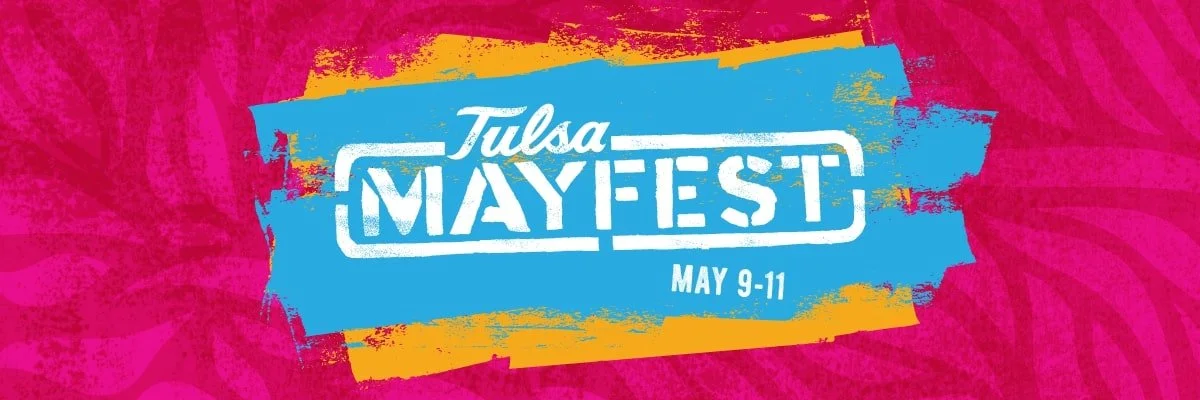
Tulsa Mayfest Website
Project Managing Web & Social for Tulsa Mayfest 2025
Large festivals don’t fail online because of bad design — they fail because digital workstreams aren’t coordinated.
For Tulsa Mayfest 2025, I served as Project Manager for the festival’s website and social media workstreams, overseeing timelines, coordination, approvals, and delivery across multiple teams and stakeholders.
My role focused on making sure digital platforms supported the festival’s scale, complexity, and public-facing needs — without becoming bottlenecks.
The Digital Challenge
Tulsa Mayfest is a multi-day public festival with:
Thousands of attendees
Artists, musicians, vendors, sponsors, and partners
Constant updates tied to programming, registration, and logistics
High visibility and public expectation
The challenge wasn’t just creating content — it was keeping the website and social channels accurate, aligned, and responsive as plans evolved.
My Role
As Project Manager, I oversaw the digital ecosystem supporting Tulsa Mayfest 2025, acting as the connective tissue between leadership, marketing, design, and operations.
Rather than creating every asset myself, I ensured the right work happened in the right order — with clarity, accountability, and follow-through.
Scope of Work
Website Project Management
Managed the website workstream, including structure, updates, and timelines
Coordinated updates tied to:
Artist and program announcements
Vendor and participant information
Registration and e-commerce needs
Festival logistics and public information
Served as the liaison between operations, marketing, and web teams
Ensured content accuracy as plans and approvals shifted
Social Media Project Management
Project managed the social media team, aligning content with festival milestones
Coordinated timelines for announcements, campaigns, and promotions
Supported content planning around:
Artists and performers
Community partnerships
Special initiatives and festival moments
Helped maintain consistency between social messaging and website information
Cross-Team Coordination
Managed approvals across leadership and stakeholders
Reduced bottlenecks by clarifying ownership and timelines
Ensured digital teams had the information they needed to execute efficiently
Bridged operations and marketing so updates reflected real-time planning
The Approach
My approach to digital project management emphasized:
Clarity over control
Systems over scramble
Coordination over micromanagement
By treating the website and social channels as operational tools — not just marketing outputs — the digital presence stayed usable, current, and aligned with the on-the-ground festival experience.
The Outcome
Tulsa Mayfest 2025’s digital platforms functioned as reliable, public-facing resources throughout the planning and festival period.
Behind the scenes, clear project management supported:
Faster updates
Fewer last-minute scrambles
Better alignment between teams
Reduced friction during peak production moments
Digital didn’t create extra work — it supported the work already happening.
Why This Work Matters
Digital success at large events isn’t about flashy posts or clever layouts. It’s about coordination, accuracy, and timing.
This project reflects the kind of digital work I do best:
Managing complex web and social ecosystems
Supporting creative teams with structure
Keeping public-facing platforms aligned with real operations
Leading without needing to be the loudest voice in the room
Managing digital at scale requires more than content.
If you’re running a festival, nonprofit, or public-facing organization and need someone to project manage your website, social media, or digital systems so they actually support your work, let’s talk.
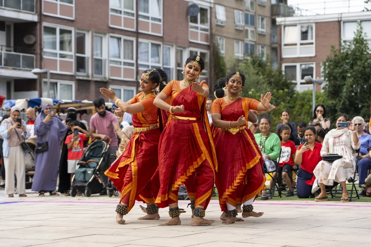
Regent’s Roots Festival Graphics
It all begins with an idea.
Website & Graphic Design for Regent’s Roots Festival 2024
For Regent’s Roots Festival 2024, produced by Old Diorama Arts Centre (ODAC) in partnership with Fitzrovia Youth in Action, I supported the festival’s digital presence through website updates and graphic design, ensuring information, visuals, and messaging stayed clear, accessible, and aligned throughout the planning and delivery process.
This work focused on translating a community-centered, artist-driven festival into digital and visual tools that supported audiences, artists, and partners alike.
The Digital & Design Challenge
Community festivals rely on clarity just as much as creativity.
Regent’s Roots required:
A website that reflected evolving programming
Visual assets that worked across print, digital, and on-site use
Materials that were welcoming, legible, and easy to navigate
Consistency across platforms without over-polishing the community feel
The challenge was creating usable, adaptable assets that could keep pace with a live, people-centered event.
My Role
I supported Regent’s Roots through ongoing website management and graphic creation, working closely with the ODAC team to ensure digital and visual elements stayed accurate and cohesive as plans developed.
Graphic assets were designed using Adobe Illustrator, allowing for scalable, print-ready, and digitally adaptable files that could be deployed quickly across formats as needs evolved.
Scope of Work
Website Support
Ongoing website updates as programming evolved
Publishing performance schedules, artist information, and event details
Ensuring clarity around timing, location, and accessibility
Supporting a clean, user-friendly experience for a public audience
Graphic Design & Visual Assets
Using Adobe Illustrator, I created graphics across multiple touchpoints, including:
Festival maps and wayfinding materials
Digital and print advertisements
Program layouts and schedule graphics
T-shirt designs
Social media graphics supporting festival promotion
All assets were designed to be flexible, readable, and easy to deploy across channels — from social feeds to on-site signage.
The Approach
My approach emphasized function-first design:
Prioritizing clarity and accessibility
Designing assets that could be reused or adapted quickly
Maintaining visual consistency without overcomplicating layouts
Keeping community and youth audiences in mind
The goal wasn’t visual noise — it was support.
The Outcome
The Regent’s Roots digital and visual materials worked together to:
Keep audiences informed as programming developed
Support smooth navigation and on-site experience
Reinforce the festival’s identity across platforms
Reduce confusion and last-minute scrambles for information
Website updates and visual assets functioned as tools — quietly supporting the festival’s success rather than competing for attention.
Why This Work Matters
Strong digital support at community festivals isn’t about flashy branding. It’s about clarity, trust, and accessibility.
This project reflects the kind of digital and design work I do best:
Supporting live events with adaptable web content
Creating Illustrator-based graphics that translate cleanly across formats
Working closely with production teams to stay aligned
Balancing creativity with real-world constraints
Digital support should make events easier — not louder.
If you’re producing a festival or community event and need help managing website updates and creating graphics that actually support your audience, let’s talk.
Designing for Arts Institutions
It all begins with an idea.
Print Advertising for 108 Contemporary (OVAC Magazine, Summer 2024)
In Summer 2024, I created a full-page print advertisement for 108 Contemporary, featured in the Oklahoma Visual Arts Coalition (OVAC) Magazine.
This project focused on translating a multi-exhibition gallery schedule into a single, clear visual piece designed for a print publication audience — balancing readability, hierarchy, and institutional voice.
The Context
108 Contemporary is a nonprofit contemporary art space in Tulsa, showcasing exhibitions across art, craft, and design. For the Summer 2024 issue of OVAC Magazine, the goal was to highlight multiple overlapping exhibitions while maintaining clarity and visual cohesion within a full-page print ad.
The piece needed to:
Communicate exhibition titles, dates, and artists at a glance
Maintain strong alignment with 108 Contemporary’s brand
Meet print publication standards and specifications
Feel refined, legible, and archival — not disposable
My Role
I designed the advertisement from concept through final production, working in Adobe Illustrator to ensure the layout was fully scalable, print-ready, and adaptable for potential reuse across other formats.
This was not a social-first graphic — it was designed specifically for print, with attention to typography, spacing, and hierarchy appropriate for a magazine context.
Scope of Work
Full-page print ad design for OVAC Magazine
Layout and hierarchy for multiple exhibitions and timelines
Integration of artist, juror, and institutional credits
Alignment with existing brand identity and tone
File preparation for print publication
The final design highlighted:
Fiber Works 2024 (Juried by Shin-Hee Chin)
Natural Rhythms by Hayley Nichols & Nic Annette Miller
Gallery hours, location, and accessibility information
All elements were structured to guide the reader smoothly through dense information without visual overload.
The Approach
My approach emphasized clarity-first design:
Strong typographic hierarchy
Balanced negative space
Visual consistency across sections
Readability at multiple viewing distances
The goal was to create a piece that functioned both as promotion and as documentation — something that could live comfortably within a magazine and still represent the institution well over time.
The Outcome
The final ad successfully communicated multiple exhibitions within a single page while maintaining a calm, professional presence consistent with 108 Contemporary’s mission.
It served as:
A promotional asset for gallery programming
A polished representation of the institution within a regional arts publication
An example of design that supports cultural work without overpowering it
Why This Work Matters
Print design for arts institutions requires a different skill set than fast-turn digital content.
It demands:
Respect for content and context
Precision in layout and hierarchy
Understanding of print standards
Design that supports longevity, not just immediacy
This project reflects the kind of design work I do best: clear, intentional, and built to support organizations doing meaningful cultural work.
Good design should make information easier to absorb — not harder.
If you’re an arts organization, nonprofit, or cultural institution looking for thoughtful print or digital design that respects your work and your audience, let’s talk.